Free readability tools to check for Reading Levels, Reading Assessment, and Reading Grade Levels.
[ HOME ] Check Your Readability: Check Text Readability NOW  Free Readability Calculators Learn about Readability Formulas: Dale-Chall Formula Flesch Reading Formula The Fry Graph SPACHE Formula [ View All ] Readability Help: [ View All Articles] Writing Tips: [ View All Articles] English Writing Products: StyleWriter software Site Map About Us Contact Us Write for Us |
Brush Up on Brochure Printing and Lay-outing Brochure printing, to borrow the term, doesn't take a rocket scientist to figure out. It simply is a single page print material that can be used for advertising products, promoting travel hotspots, informing the public about illnesses and symptoms and the like.
It is a powerful tool that attracts buyers or consumers to pick one up and browse through its contents. It can stand in a corner or on a desk by itself and people will willingly grab a copy to review your establishment's various offerings.
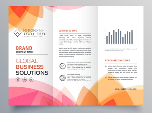
An effective brochure should be printed in high quality, designed effectively and should contain a sufficient amount of information to satisfy the needs of consumers for details. A successful brochure printing doesn't just involve these. However, these still remain as some of the most important ones you should be considering making a brochure. Brochures are very flexible that even as a promotional tool, the main advocacy is to provide consumer's with ample information. Along with the information, is of course, is the need to inspire, to create a demand, a want, a yearning for your said products or services. Persuasion is always a key factor and should never be left out of the game. For after all, brochure printing is only one of the many mediums that you can use to elicit a positive response. The response, specifically, points to purchasing, visiting the store and going on line. How to create that demand depends on your concept and campaign. How is that campaign going to be effectively read, is another question entirely. Most people forget that brochures contain information meant to be read. Barriers in layouts should then be eliminated to fully create a free flowing movement of information. Another thing that is taken for granted is the way how selecting a fold for your brochures can affect its over all look and feel. One does not just fold a piece of paper without a pre-conceived notion of its purpose. Here then are some tips to open up your eyes on discovering the do's of brochure printing and lay-outing. 1. Be sure not to put in or crowd all too important details within or along the crease of the folds of your brochure. Risking running your text through the creases lessens the readability of your brochure and discourages further reading. 2. Panels dictate the flow of the information of your text. Take advantage of the panels to create a transition from one to the other. Note at how the brochures folds or opens up. You can use it to signify where the text will be need a pause or where the next text or image should be placed to keep the reader in excitement or hold them in suspense. 3. Folds prove to be an essential, and at times a bit tricky as well, element that organizes your brochure. The panels help categorize the contents of your brochure. In such a manner, it can easily lead the eyes to browse through the brochure in a familiar pattern - from general to specific and vice versa. 4. Make sure that your design is not interrupted as to where the folds opens and closes on itself. Vital images should not be cut off haphazardly or it will lose the impact it is intended to make. 5. Determine which fold would be more appropriate for your design. A C-fold or trifold readily opens up to a big space where you can lay-out a whole lot of information, both visually and textually in one fell sweep. 6. To continue, a Z-fold creates an accordion type of brochure wherein it gives us the illusion of it lengthening outwards. Its panels can concentrate information section by section or create a continuous flow of images or text with little disruption since it can easily be folded out. 7. The half fold reserves a much bigger space for each of its page. Lay-outs for half folds must be designed efficiently so as to maximize the space available. Every image and text must be set tightly into place. About Readability >> READABILITY FORMULAS New Dale-Chall - Flesch Reading Ease - Flesch Grade Level - Fry Graph -Gunning FOG - Powers-Sumner- Kearl - SMOG - FORCAST - Spache  StyleWriter software: use it to write better content! Download your free trial! |
|
|
||